A New Salesforce User Interface
The Salesforce Design Team has released (in beta) a new Salesforce User Interface based on the Salesforce Lightning Design System (SLDS) version 2.
You can get all the details here: https://www.lightningdesignsystem.com/
Salesforce describes SLDS 2 as follows:
Salesforce Lightning Design System 2 (SLDS 2 beta) provides a rich, new architecture, reusable components, and modern web standards that help you design and build apps that match the core Salesforce experience.
SLDS 2 includes the resources to create user interfaces consistent with Salesforce design principles, visual language, and best practices. Rather than spend time focusing on pixels, developers can focus on application logic and designers can focus on user experience, interactions, and flows. This system ensures creation across all Salesforce applications is consistent, accessible, and efficient.
How Can I Get it
The first step is to create a new Developer Org (or a sandbox) that will have the capability to enable SLDS 2. Unless your org was created in February 2025 or later, you will probably need to create a new one to get a SLDS version 2 capable org. More information about the availability is here: https://help.salesforce.com/s/articleView?id=xcloud.customize_ui_enhancedlex.htm&type=5
Change to this new UI:
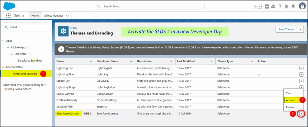
Once you have the new org, you need to configure Themes and Branding under setup.
Select the Salesforce Cosmos theme and activate it:
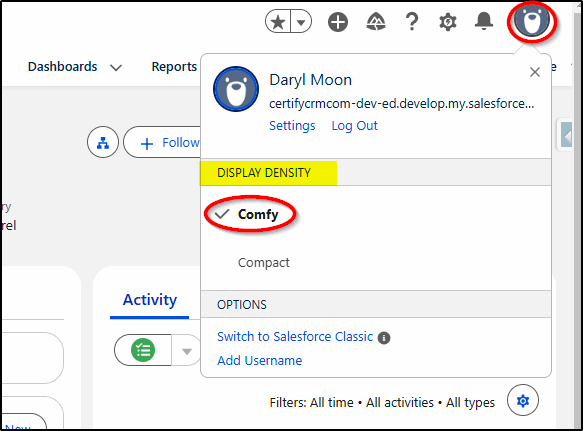
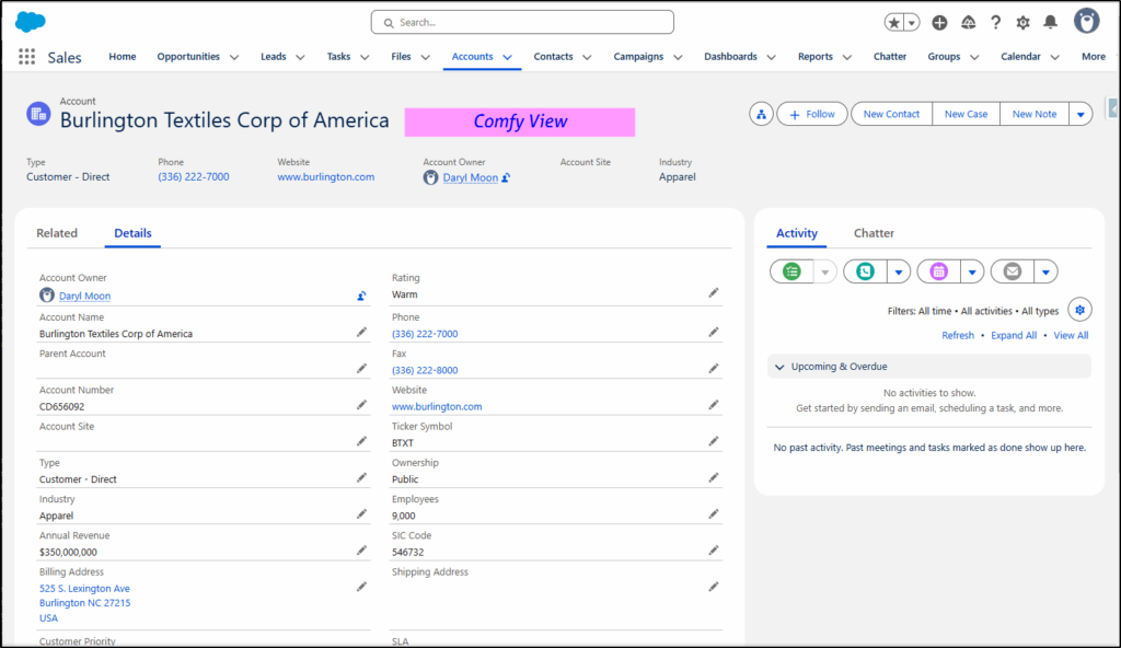
With the Display Density set to the default (Comfy)…
you can immediately see the difference with more rounded boxes and buttons. This is the default Comfy View that is a bit too generous with white space.

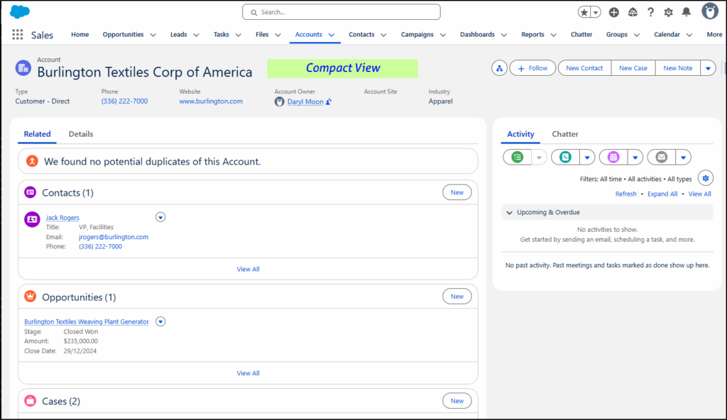
If you switch the Display Density to Compact, the whitespace is reduced significantly, allowing more information on the same size screen.
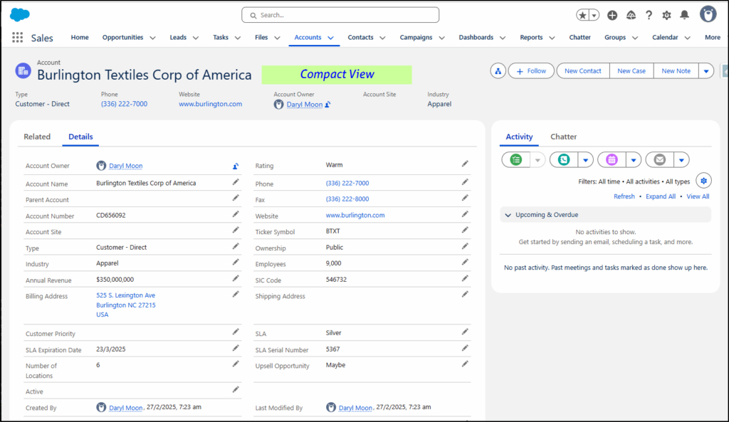
Switching back to Comfy view and displaying the Details tab, again there is a fair amount of whitespace.
When switching to Compact again, the Details tab shows labels on the same line as the values (not above like in Comfy view), which results in about 25% more information on the same sized page.
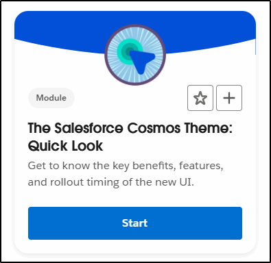
Trailhead
There is a Trailhead module all about this new Cosmos theme. It’s a Quick Look one so it’s just a 5 min intro:
Note: Two things mentioned/shown in the SLDS website are still in the works: 1) the side menu and 2) dark mode.
